Retrograde explores how digital shopping can better reflect the tactile, exploratory experience of browsing vintage clothing in person. The platform was designed to support discovery, storytelling, and trust in a resale context where every item is unique. The work focused on structuring navigation, product detail, and checkout flows in a way that balances aesthetic expression with clarity and usability.
The resulting concept combines brand identity, information hierarchy, and interaction design to create an experience that feels curated rather than transactional, while still supporting efficient browsing and purchase decisions.
Retrograde – online thrifting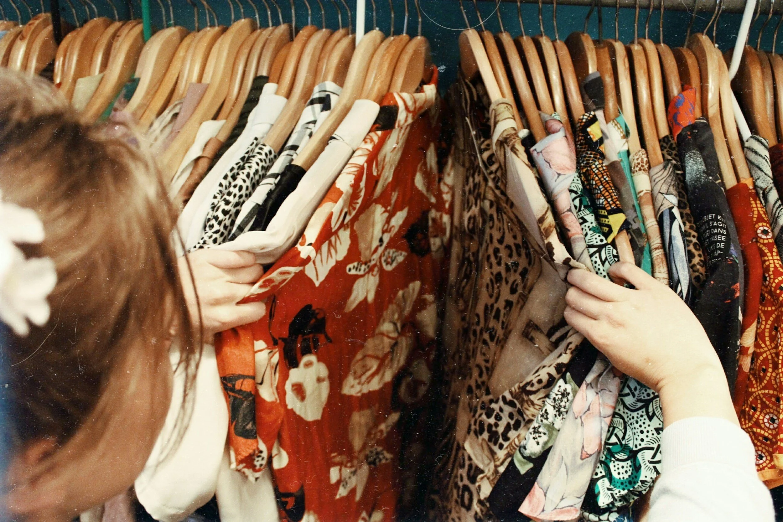
Understanding the Vintage Shopper
Early exploration focused on how users approach vintage shopping online compared to traditional retail. Vintage shoppers are often motivated by discovery, individuality, and narrative rather than speed alone. They want to browse, compare eras, and understand the condition and story behind each piece before committing to a purchase.
At the same time, interviews and informal research highlighted common points of friction. Users expressed uncertainty around fit, condition, and value, especially when purchasing one-of-a-kind items without the ability to try them on. This created a need for clearer product information, consistent categorization, and visual cues that support confidence without overwhelming the experience.
These insights shaped the core design tension of Retrograde: preserving a sense of exploration while reducing ambiguity at key decision points.
Designing for Discovery & Orientation
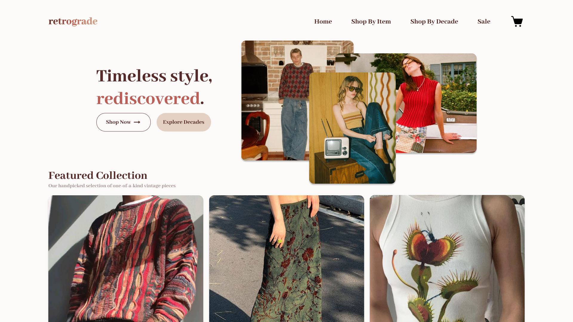
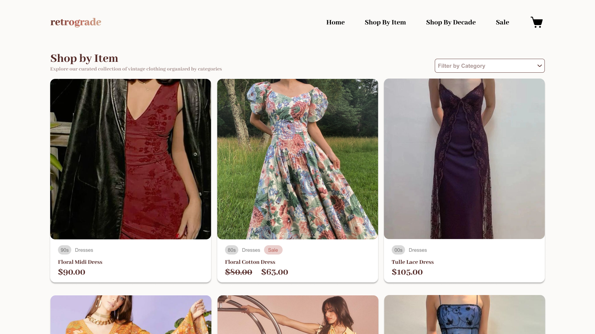
Navigation was treated as a primary design lever rather than a secondary feature. In addition to standard category browsing, Retrograde introduces browsing by decade as a way to reflect how users mentally organize vintage fashion. This structure supports both goal-oriented shopping and open-ended exploration, allowing users to move fluidly between browsing modes.
The home page emphasizes visual rhythm and editorial framing, setting expectations for a curated experience rather than a discount marketplace. Featured collections and imagery guide attention without dictating a single path forward, encouraging users to explore at their own pace.
Across listing pages, layout and spacing were intentionally restrained to keep focus on the garments themselves. Filters are present but understated, supporting refinement without interrupting browsing flow.
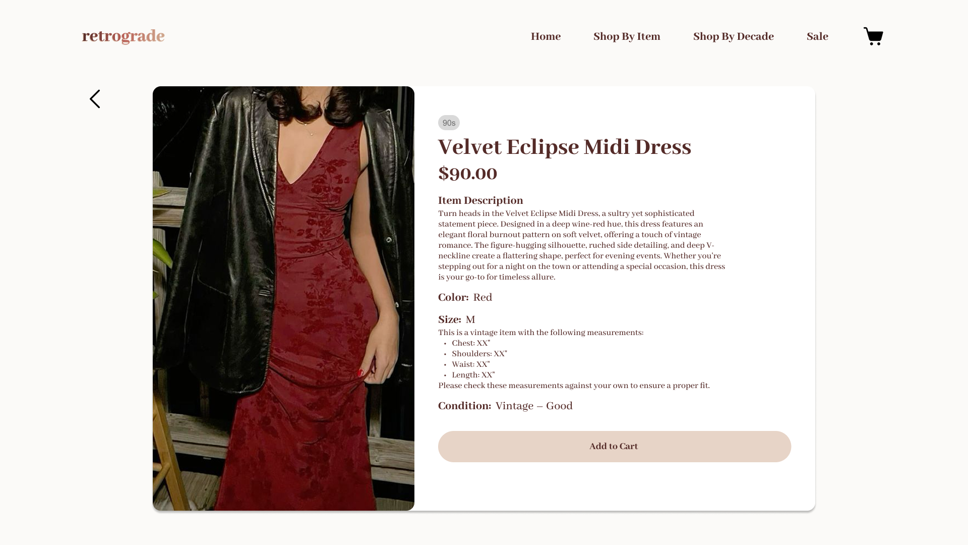
Product Detail & Purchase Confidence
Product detail pages were designed to address the specific anxieties of vintage purchasing. Clear labeling of decade, condition, and price anchors the user’s understanding immediately, while longer descriptions provide context around fit, material, and styling potential.
Rather than treating condition as a footnote, it is surfaced as a first-class piece of information to build trust. Visual hierarchy prioritizes imagery while ensuring that critical details remain easily scannable.
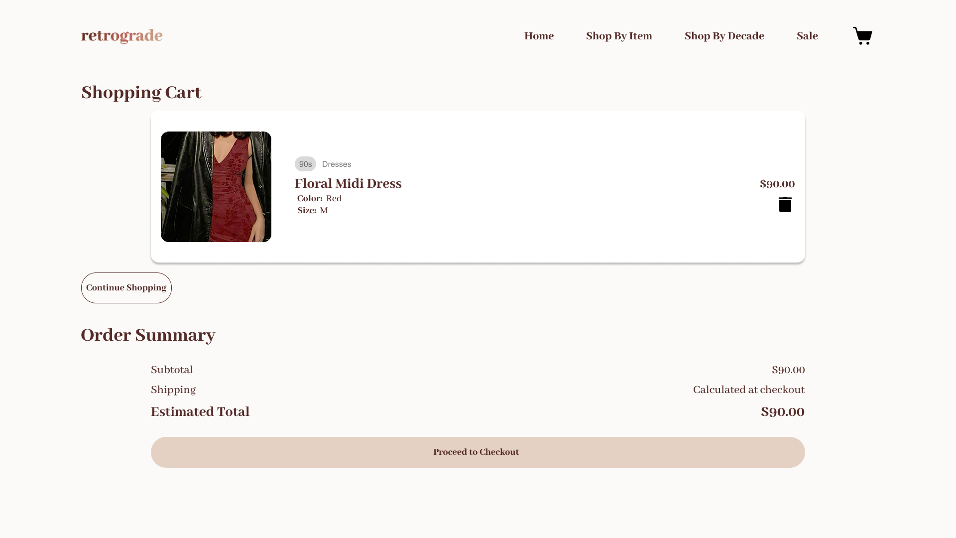
The cart and checkout flow were kept intentionally simple. Because vintage purchases are often deliberate and emotionally driven, the goal was to remove unnecessary friction at the final stages and allow users to complete transactions with confidence.
Brand, Aesthetic, & Interface Cohesion
Retrograde’s visual language was designed to feel warm, timeless, and understated, mirroring the values of vintage fashion itself. Typography, color palette, and spacing work together to create a sense of calm and intention, avoiding the clutter often associated with resale platforms.
The interface supports the brand without overpowering the content. UI elements recede when not needed, allowing product photography and editorial imagery to take center stage. This balance reinforces Retrograde’s positioning as a curated collection rather than a high-volume storefront.
Reflection
Retrograde demonstrates how UX and visual design can shape not just usability, but emotional tone and trust in digital commerce. By aligning navigation, information design, and brand expression with the mental models of vintage shoppers, the platform reframes online resale as an experience rooted in discovery rather than compromise.
The project highlights the role of product design in translating subjective values like style, authenticity, and curation into concrete interface decisions that guide behavior and reduce uncertainty.