TTC Entrance Design AuditThe Tsungming Tu Complex (TTC) first-floor entrance was evaluated through an environmental design audit focused on how the space supports brief, everyday interactions. Using observation and stakeholder interviews, the audit examined how students, faculty, visitors, and delivery drivers move through the entrance, pause momentarily, orient themselves, and navigate to adjacent wings. The goal was to identify sources of friction during quick, unplanned interactions and highlight opportunities to better align environmental cues with existing patterns of use.
This work focused on understanding the space as it currently functions, rather than proposing a complete redesign. Findings informed a set of design recommendations centered on circulation clarity, seating behavior, ergonomic support for short-term use, and wayfinding visibility.
Observing a Transitional Space in Use
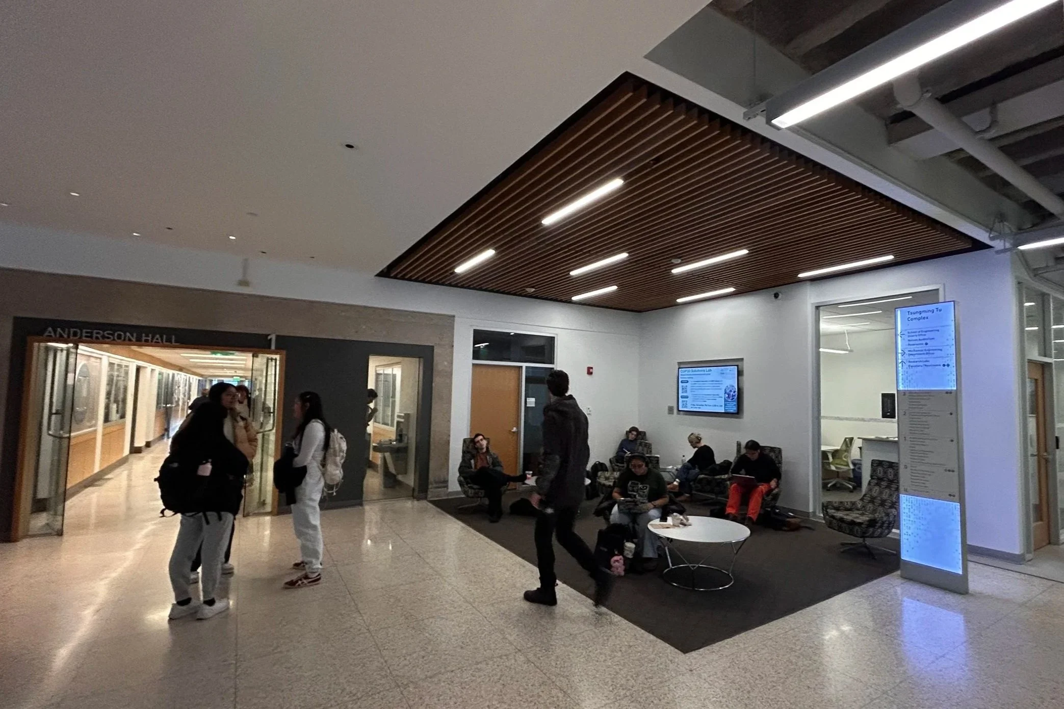
The TTC entrance functions primarily as a transitional space rather than a destination. Students move through it between classes, pause briefly to check messages or wait for friends, and orient themselves before continuing to adjacent wings. Faculty, staff, visitors, and delivery drivers also rely on the entrance for quick wayfinding and first impressions, often without prior familiarity with the building. Most interactions are short, unplanned, and driven by movement rather than intention to stay.
Observations conducted across different times of day revealed consistent behavioral patterns. The entrance acted largely as a pass-through zone, with users stopping only momentarily. Seating was used for short laptop sessions, phone use, or waiting between classes, but longer stays were rare. Users often perched on the edges of seating or balanced laptops on their laps, suggesting hesitation to fully settle into the space. Conversations were brief and informal, reinforcing the entrance’s role as a momentary pause rather than a place to linger.
Movement through the space revealed additional friction points. First-time visitors and delivery drivers frequently slowed down or stopped to scan for cues, indicating uncertainty about where to go next. Signage was easy to miss unless actively searched for, and the layout did little to guide attention toward key destinations. These small pauses and course corrections highlighted how navigation in unfamiliar spaces is shaped more by environmental cues than explicit instructions.
Together, these observations showed that the entrance was already supporting specific behaviors, but not always clearly or comfortably. The opportunity was not to redefine how the space was used, but to better support the brief, transitional interactions that were already taking place by improving clarity, flow, and environmental guidance.
Environmental Cues and Decision-Making
Further analysis showed that many observed behaviors were shaped by how environmental cues were communicated. Directional information existed, but it often required active searching rather than being reinforced through layout, circulation paths, or spatial hierarchy. As a result, users frequently relied on trial-and-error navigation, especially when unfamiliar with the building.
Circulation routes were not clearly distinguished from areas intended for pausing or seating, which blurred expectations about where to walk, where to stop, and where waiting was appropriate. Seating placed close to primary movement paths reinforced short-term use but did not support comfort or clarity. Signage was easy to overlook unless users were already scanning for it, placing additional cognitive effort on individuals during moments that required quick decisions.
Rather than failing outright, the entrance functions in a way that shifts responsibility onto users to resolve uncertainty on their own. This creates an opportunity to better align environmental signals with the behaviors already taking place, reducing hesitation and supporting smoother movement through the space.
Design Opportunity
The audit revealed that the entrance does not need to be reprogrammed or fundamentally changed. Its role as a high traffic, transitional space is already well established through everyday use. The opportunity lies in better aligning environmental cues with the behaviors that are already taking place, so movement, pausing, and navigation feel more intuitive and require less effort from users.
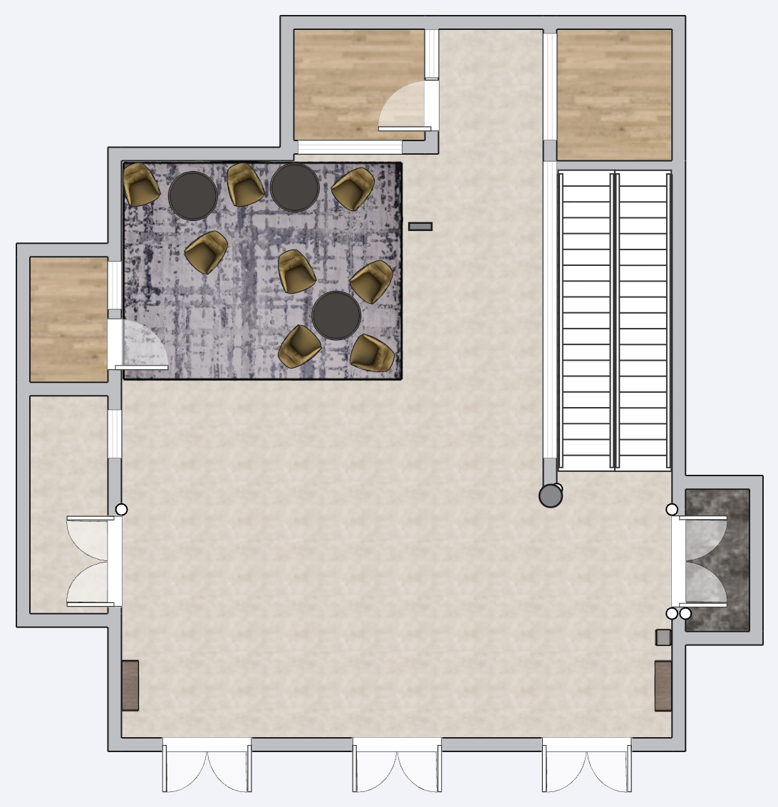
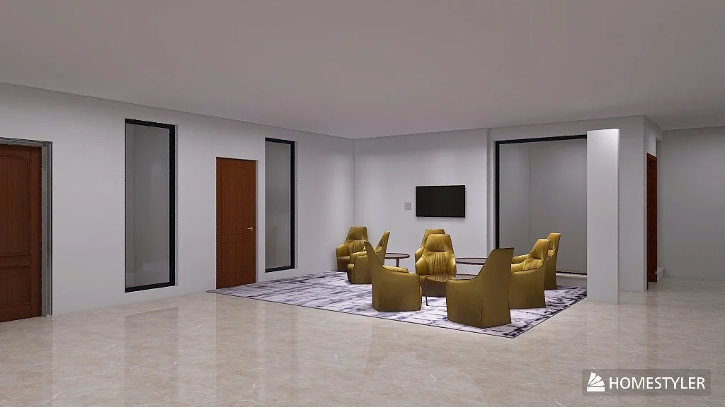
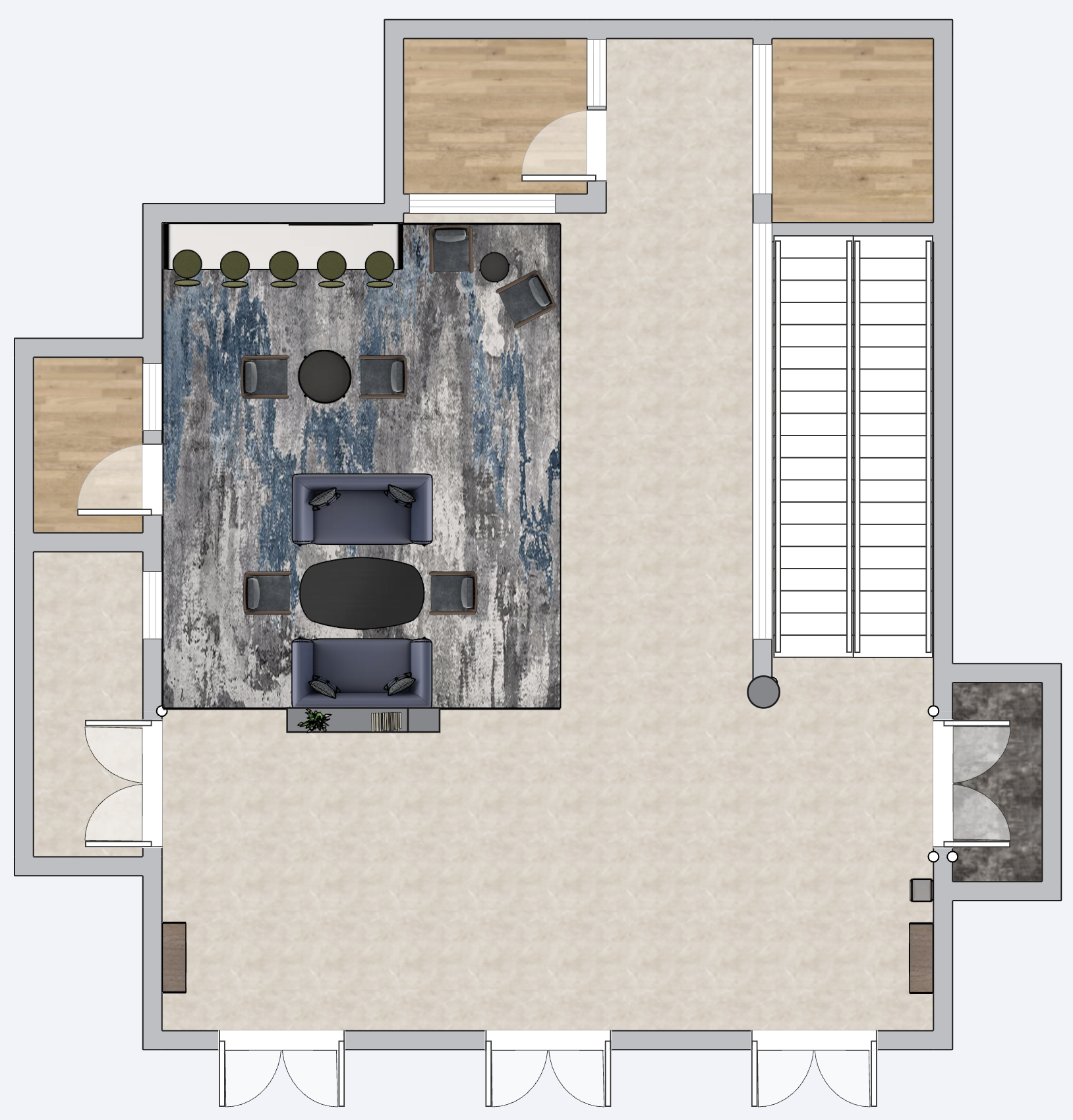
Viewed in plan and perspective, the entrance prioritizes openness and throughput but offers limited visual guidance about where to move versus where to stop. Circulation paths and seating zones blend together, and wayfinding cues are present but not emphasized through spatial hierarchy. As a result, users rely on active scanning and moment by moment decision making rather than being guided naturally by the environment.
Rather than introducing new functions, the focus shifts to clarifying intent. Clearer distinctions between circulation and seating zones, more legible wayfinding cues, and subtle environmental signals can help users understand where to walk, where to pause, and how to orient themselves without hesitation. These small adjustments have the potential to significantly reduce cognitive load during brief interactions, especially for first time visitors and delivery drivers.
Taken together, the findings point toward design interventions that reinforce what the space already supports. By strengthening visual hierarchy, spatial clarity, and guidance at key decision points, the entrance can better serve its role as a connective threshold that supports fast, unplanned use while remaining welcoming and accessible to a wide range of users.
From Insight to Intervention
The design response focused on reinforcing behaviors already present in the space rather than introducing new ones. Observations showed that users primarily move through the entrance, pause briefly, and make quick navigation decisions, often under time pressure. The proposed interventions therefore prioritize clarity, legibility, and ease of interpretation over added functionality or visual complexity.
Design decisions centered on reducing ambiguity at key moments. Circulation paths and seating areas were more clearly defined to help users intuitively understand where movement is encouraged and where pausing is supported. Wayfinding was treated as a spatial problem rather than a signage problem, using layout, alignment, and visual hierarchy to guide attention before users need to actively search for information.
By translating observed behaviors into targeted spatial adjustments, the intervention aims to reduce cognitive load during brief interactions while preserving the entrance’s role as an open, flexible threshold. The result is not a reimagined space, but a more legible one that supports fast, unplanned use with greater confidence and ease.
Spatial Recommendations
The proposed design builds directly on patterns identified during the environmental audit, focusing on improving clarity and usability within the existing entrance layout. Rather than introducing new functions, the recommendations refine how the space communicates movement, pausing, and orientation through targeted spatial adjustments.
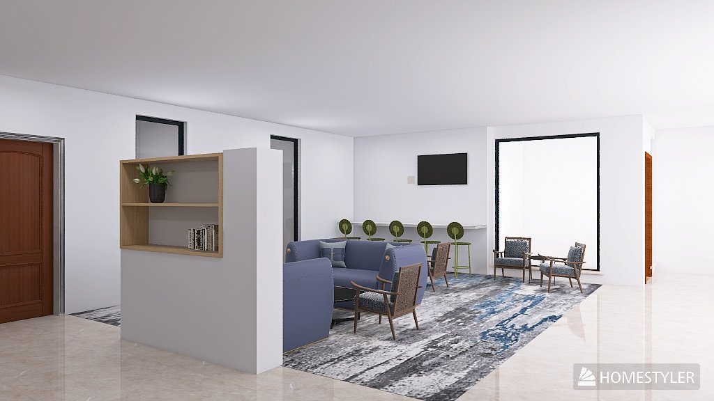
One key intervention is the clearer definition of functional zones within the entrance. An expanded carpeted area helps visually establish the central seating zone as a place for short-term use, while reinforcing circulation paths around it. This distinction supports the way users already move through the space and reduces ambiguity between areas meant for walking versus stopping.
Seating and work surfaces are adjusted to better support brief interactions. The introduction of bar-height individual workstations responds to observed behaviors such as laptop use without adequate table support, allowing users to work comfortably without committing to longer stays. Seating arrangements are organized to accommodate quick conversations and waiting without obstructing primary circulation routes.
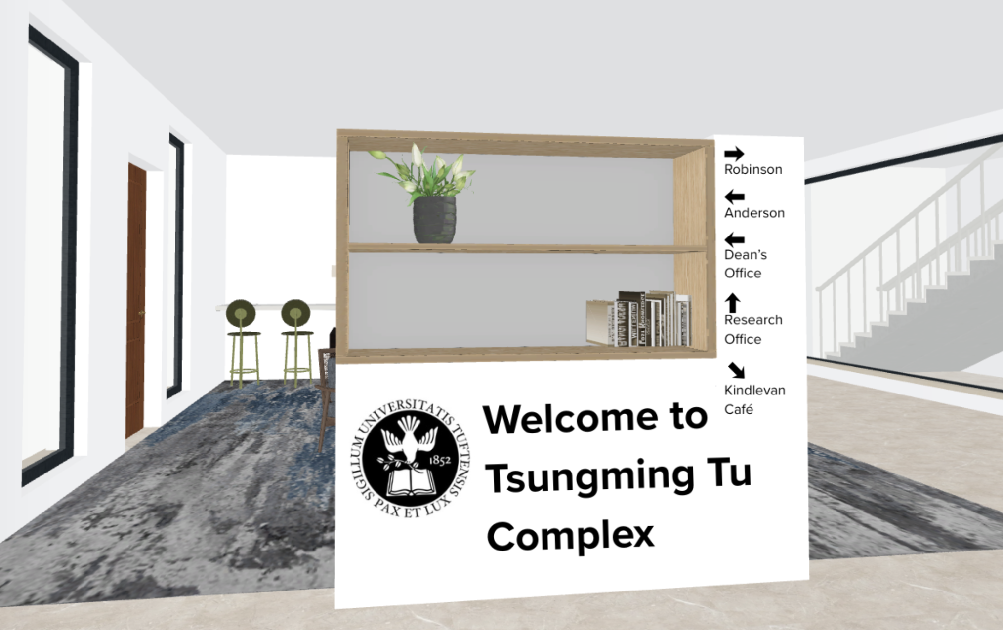
Wayfinding improvements focus on visibility and accessibility rather than added complexity. Signage is repositioned and clarified to make destinations easier to identify at a glance, with particular attention to first-time visitors and delivery drivers. Braille and accessibility considerations are incorporated to improve inclusivity and legibility across user groups.
Together, these interventions strengthen the entrance’s role as a connective threshold. By reinforcing existing behaviors through clearer zoning, more appropriate work surfaces, and improved wayfinding cues, the design reduces hesitation and supports fast, unplanned use while preserving the openness of the space.
Design Takeaway
Rather than treating the space as a blank slate, the audit surfaced opportunities to strengthen what was already working. The resulting recommendations show how environmental cues, spatial hierarchy, and modest adjustments can reduce cognitive load and support more confident navigation, especially for users encountering the space for the first time.
This project reinforced the value of observation-driven design and the role of human factors in shaping environments that feel intuitive without calling attention to themselves.
This audit demonstrated how small design decisions can have an outsized impact in spaces defined by brief, everyday interactions. By focusing on how people actually move, pause, and make decisions in the entrance, the work highlights the importance of clarity, legibility, and alignment between environment and behavior.